UX CONCEPT REDESIGN

Designing Confidence
at Checkout

A redesign concept exploring how reducing uncertainty can help users complete purchases with greater confidence. People often add products to their cart with clear purchase intent, yet leave before completing the transaction. This project investigates why confidence breaks during checkout and how design can help users move forward with greater certainty.

ROLE UX Designer
TYPE Concept Redesign
PLATFORM Mobile Ecommerce
View Prototype arrow_downward
Amazon Checkout Redesign Hero

PRICE CLARITY

₹29,990 Total

DELIVERY

Arrives Tuesday
"

People Don't Abandon Carts.
They Abandon Confidence.

THE OBSERVATION

By the time users reach checkout, the product has already done its job. They've explored the product. Compared alternatives. Read reviews. Added it to their cart.

Yet many still leave.

In many cases, the issue isn't product desirability. It's uncertainty. Questions begin to appear:

What is the final cost?

When will it arrive?

Can I trust this purchase?

This project explores how reducing those moments of hesitation could create a more intuitive checkout experience.

The Moment Confidence Breaks

Each question introduces uncertainty, and uncertainty directly affects decision making.

payments

What am I actually paying?

Users often discover important pricing details, taxes, and hidden shipping fees too late in the journey, causing immediate hesitation.

local_shipping

When will it arrive?

Delivery information can feel vague or obscured precisely when users are preparing to commit to the final transaction.

verified_user

What happens after I pay?

Questions about cancellation policies, returns, and order control can increase hesitation at the final point of friction.

DESIGN APPROACH

Designing For Confidence

Instead of designing new features, the goal was to redesign how information is presented during checkout. The interface acts as a reassuring guide rather than just a transaction terminal.

visibility

Create Pricing Clarity

Surfacing the total cost instantly removes the fear of hidden fees at the final step.

event_available

Make Delivery Expectations Visible

Positioning arrival dates prominently before the user enters payment details.

route

Reduce Unnecessary Decisions

Streamlining steps to prevent decision fatigue from derailing the purchase intent.

shield

Provide Stronger Reassurance

Adding subtle trust signals right near the primary call-to-action.

Amazon Checkout Approach

The Redesign

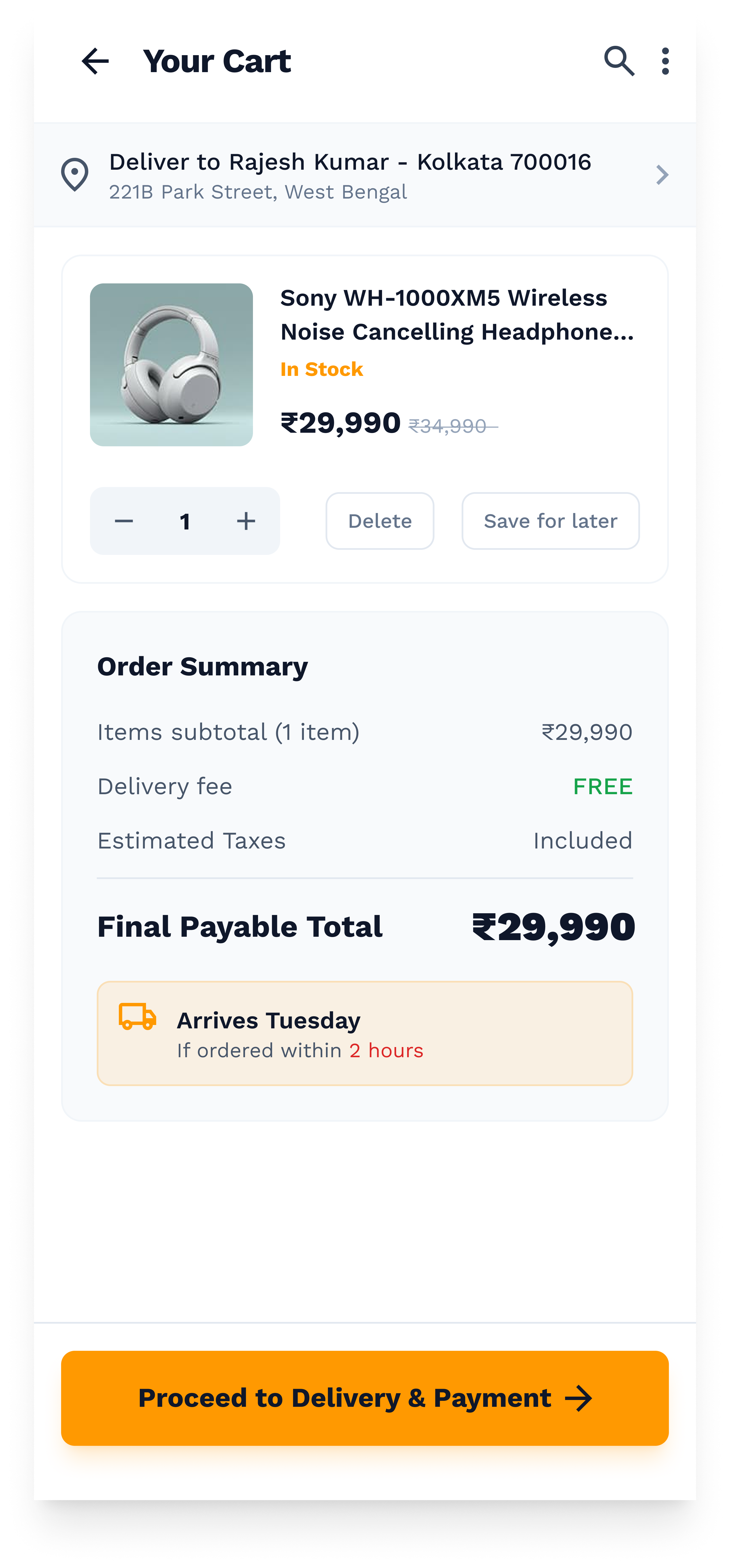
Cart Overview

Final Price Visibility & Unified Checkout Flow

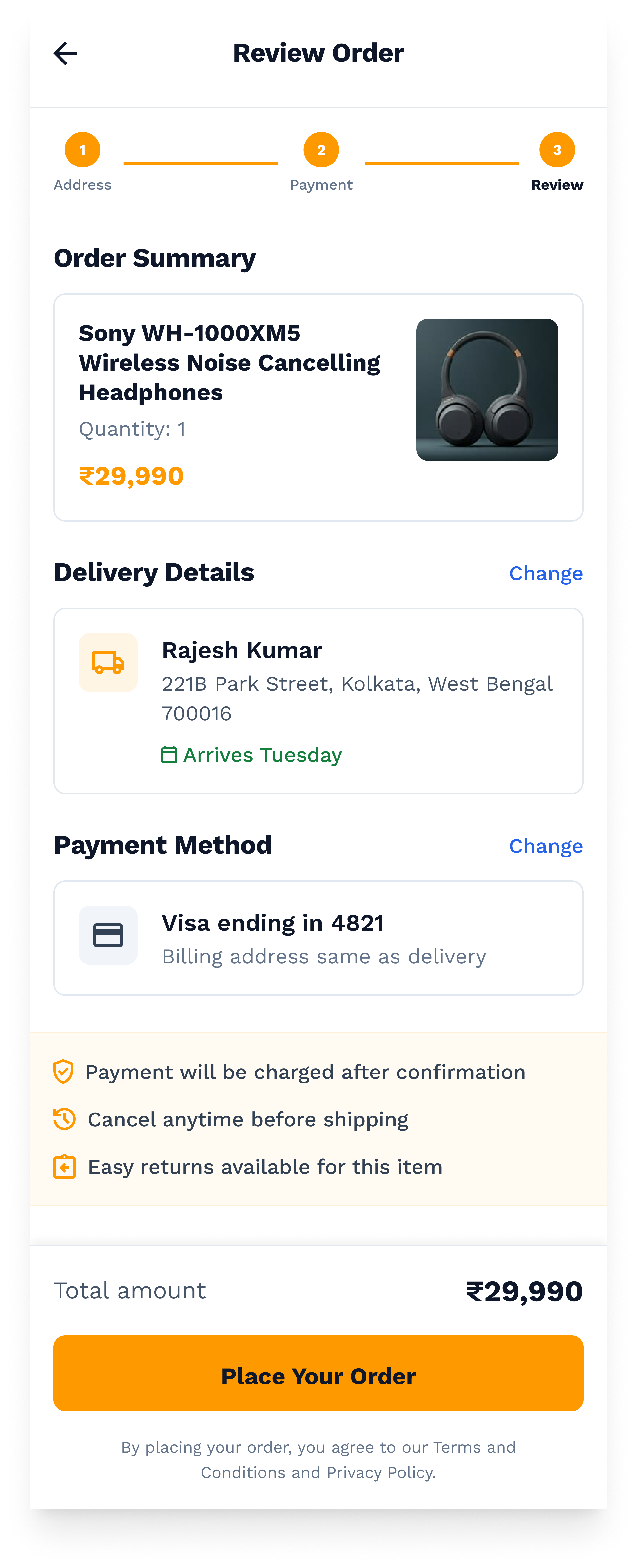
Showing the final payable amount earlier helps reduce uncertainty before commitment. By making the total cost explicitly clear upfront, we eliminate the primary cause of final-step drop-offs.

Furthermore, reducing unnecessary transitions creates a smoother purchase experience. Users can review items and proceed without navigating a fragmented multi-page maze.

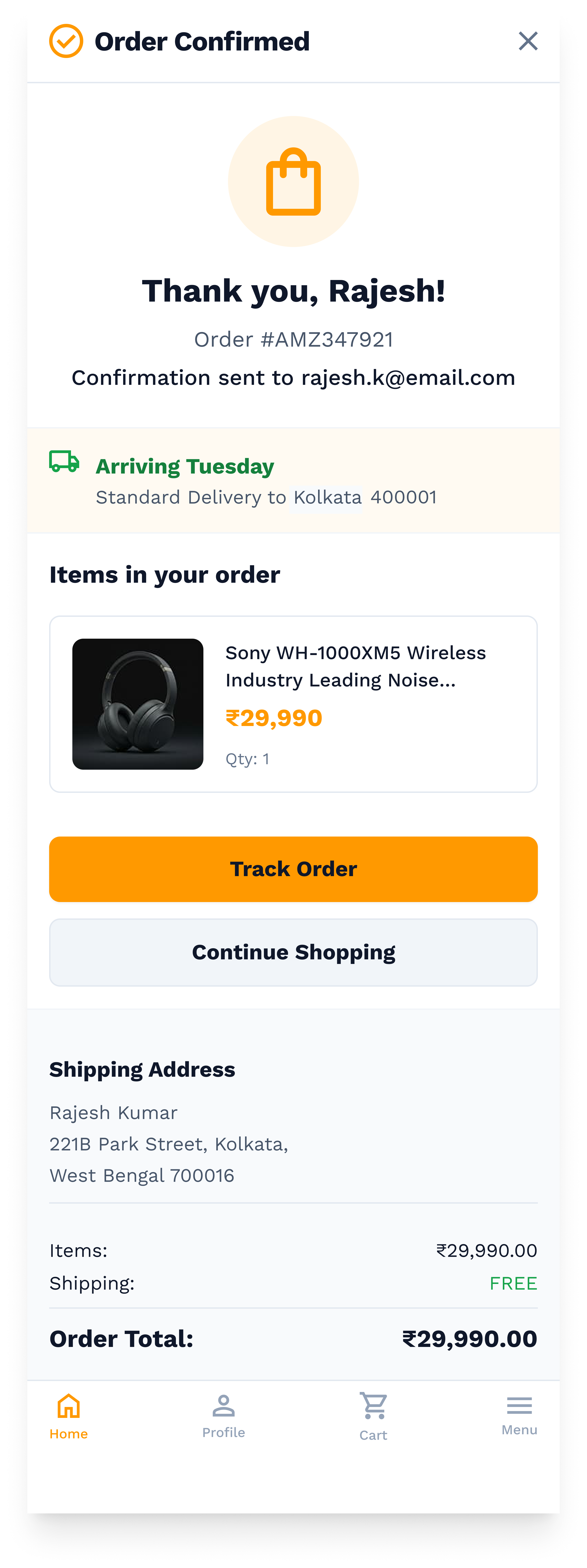
Order Confirmation

Delivery Transparency & Order Summary Persistence

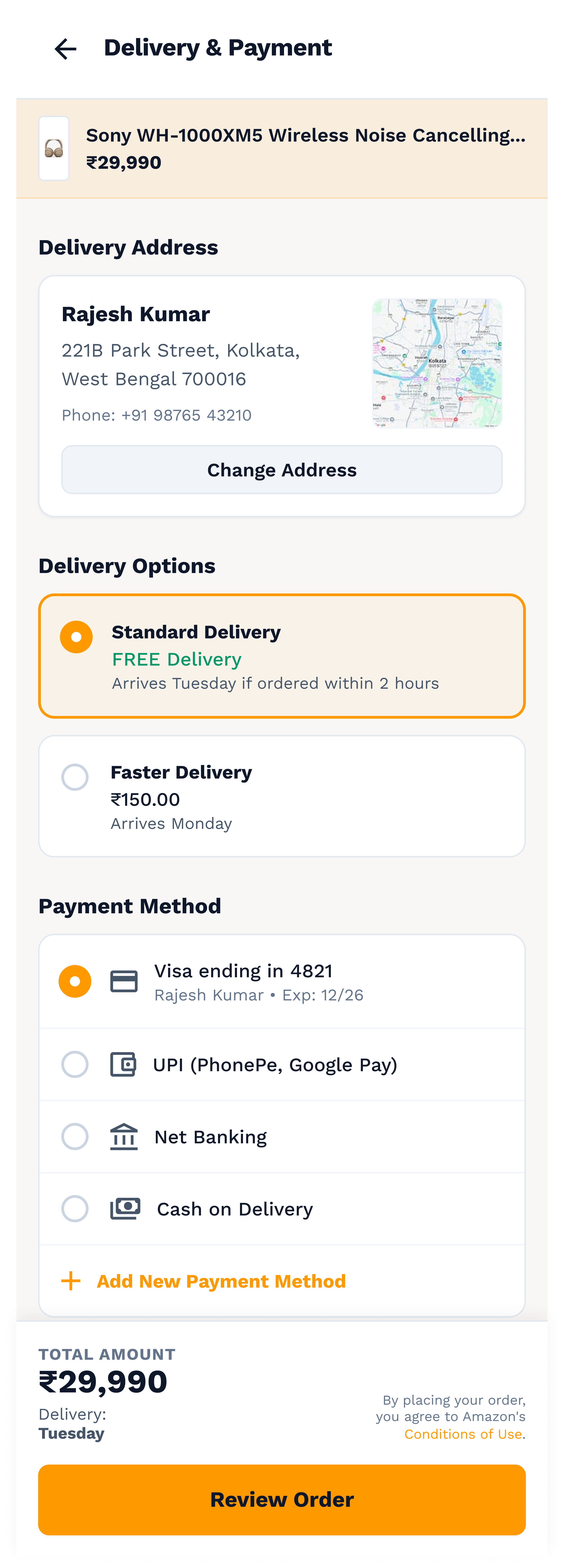
Clear delivery expectations help users make decisions with greater confidence. The interface highlights arrival dates directly on the main checkout path, tying the purchase to a real-world expectation.

Keeping critical information visible reduces the need to repeatedly verify details. An omnipresent order summary ensures the user always knows exactly what they are committing to, fostering trust.

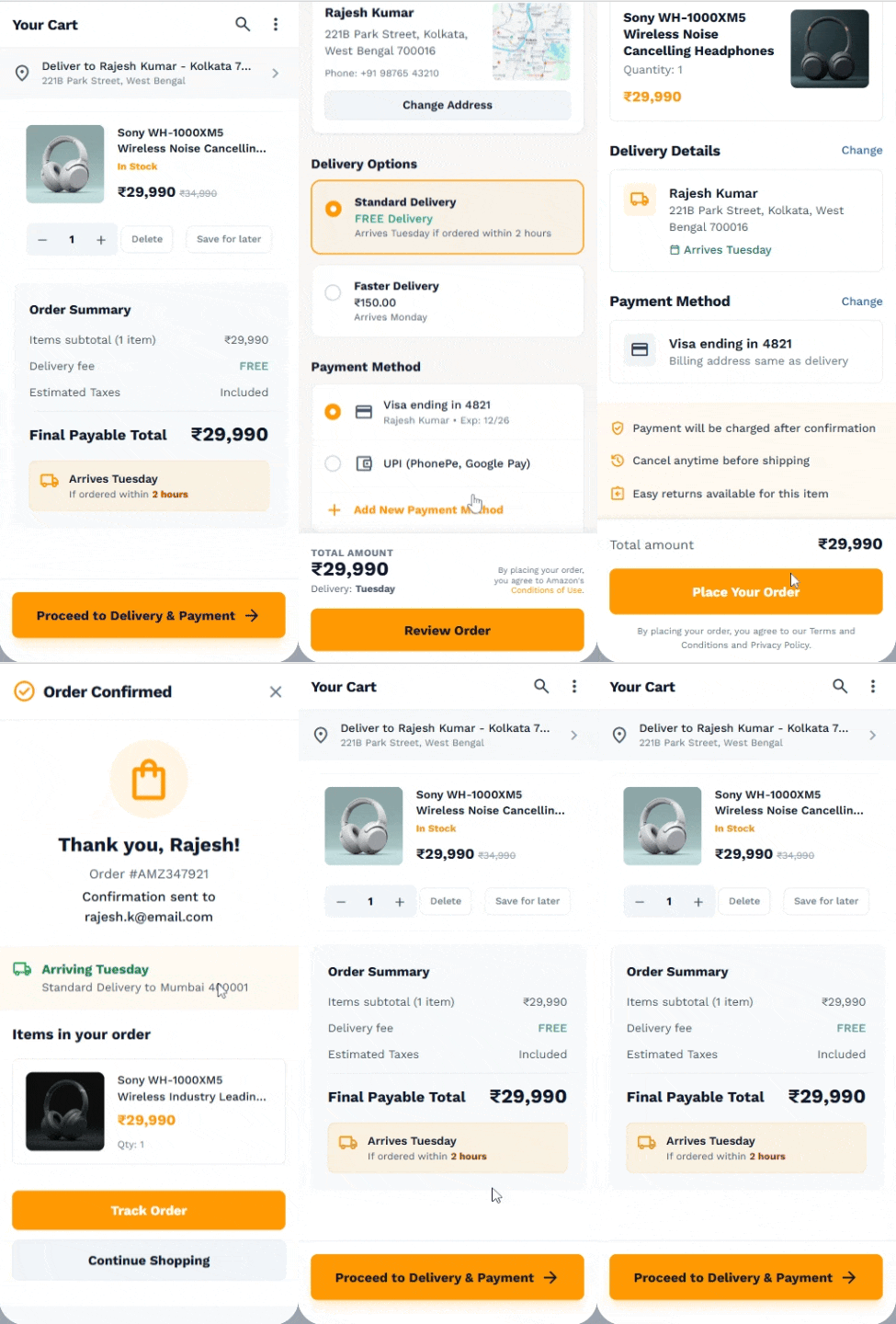
The Interactive Flow

A seamless transition from cart to confirmation, prioritizing visual stability and confidence.

Interactive Prototype

Key Design Decisions

DECISION 01

Earlier Cost Visibility

Move critical pricing information closer to decision making moments, preventing sticker shock at the end of the journey.

DECISION 02

Delivery Confidence

Provide clear arrival expectations before payment, directly linking the transaction to physical gratification.

DECISION 03

Reduced Cognitive Load

Simplify the checkout journey by stripping away distracting upsells during the most critical focus phase.

DECISION 04

Clearer Confirmation States

Help users feel confident that their action was successful through positive visual feedback and immediate post-purchase clarity.

Who Does This Help?

shopping_bag

Frequent Shoppers

Faster decision making and fewer interruptions for users who just want to complete their routine purchases efficiently.

person_add

First Time Buyers

Greater confidence and trust before committing to a platform they are less familiar with.

storefront

Businesses

Potentially fewer abandoned purchases and smoother checkout experiences driving long-term customer loyalty.

"

EXPECTED IMPACT

This project was not launched and therefore no production data exists. The outcomes presented are based on research, personal surveys, behavioral analysis, and design assumptions.

Expected areas of improvement include:

  • Higher checkout confidence
  • Reduced hesitation
  • Better information clarity
  • Improved purchase completion likelihood

What I Learned

The biggest takeaway from this project was that checkout abandonment is not always a pricing problem or a usability problem.

Often it is a confidence problem.

Small moments of uncertainty can have a disproportionate impact on decision making. Design can help reduce that uncertainty by making important information visible at the right moment.

What I Didn't Solve

Cart abandonment is influenced by many factors beyond checkout design.

EXTERNAL FACTORS

  • Product pricing & market viability
  • Competitor comparison shopping
  • Available payment methods
  • Broad brand trust signals
  • Personal financial constraints

While these areas are important, addressing them properly would require significantly deeper research, behavioral testing, and production level data.

For this project, I chose to focus specifically on confidence and information clarity during checkout because I believe it is one of the most impactful opportunities within the purchasing journey.